圣杯布局与双飞翼布局
文档结构
-
本文使用的预设样式如下:
1
2
3
4
5
6
7
8
9
10
11
12
13
14
15
16
17
18
19
20
21
22
23
24
25
26
27
28
29
30
31
32
33
34
35
36
37
38
39
40
41
42
43
44
* {
margin: 0;
padding: 0;
}
.wrapper {
overflow: hidden;
width: 100%;
background-color: #333;
}
.wrapper::before {
content: 'wrapper';
color: #888;
font-size: 30px;
position: absolute;
left: 50%;
top: 50%;
transform: translate(-50%, -50%);
}
.col {
color: #333;
height: 220px;
font-size: 30px;
text-align: center;
line-height: 220px;
}
.main {
background-color: skyblue;
}
.main-wrap{
background-color: pink;
}
.left {
background-color: yellowgreen;
}
.right {
background-color: tomato;
} -
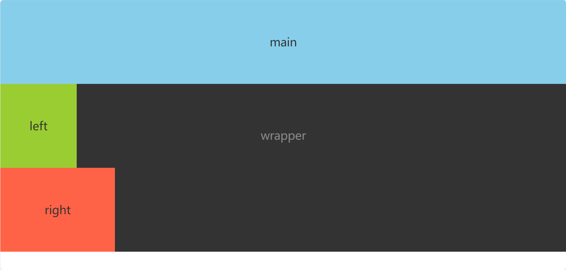
文档四部分分别为:
wrapper:整个文档的容器main:三栏布局的主要部分,放置在中间left、right:左栏和右栏
圣杯布局
原理
- 圣杯布局使用浮动+内边距+定位方式实现,父容器设置左右
padding为左右两栏宽度,留给左右两栏占据,中间部分自适应宽度。 - 优点:主内容区域无需添加一层DOM节点
- 缺点:当left部分宽度大于main部分宽度时会出现布局混乱。
实现
-
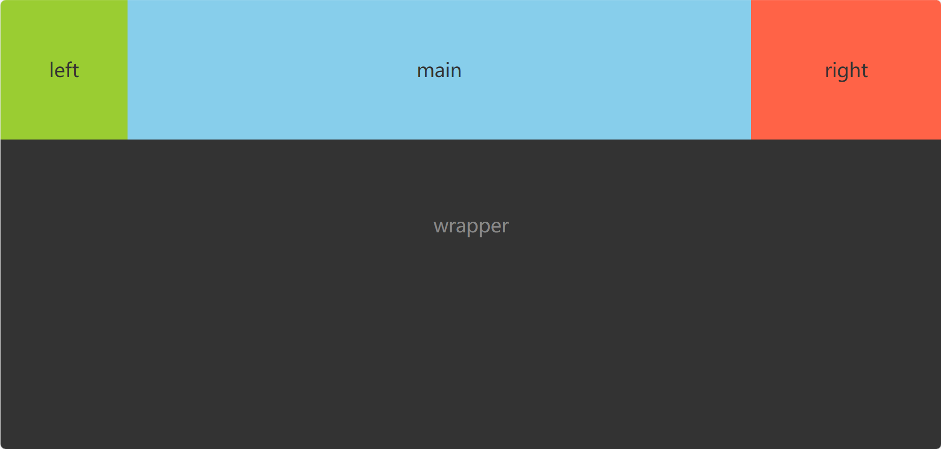
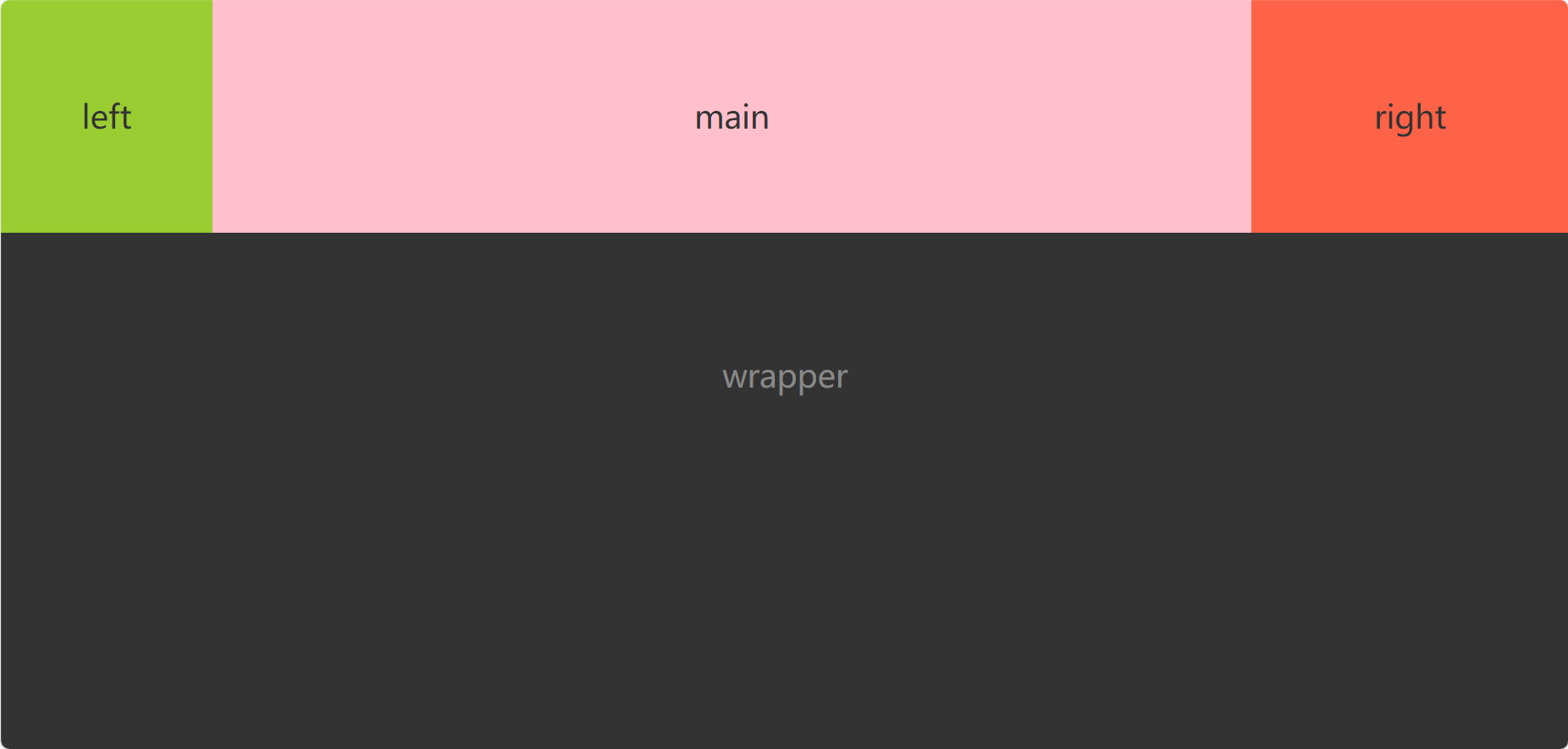
建立HTML结构如下:
1
2
3
4
5
6
7<body>
<section class="wrapper">
<section class="col main">main</section>
<aside class="col left">left</aside>
<aside class="col right">right</aside>
</section>
</body>效果如下:

-
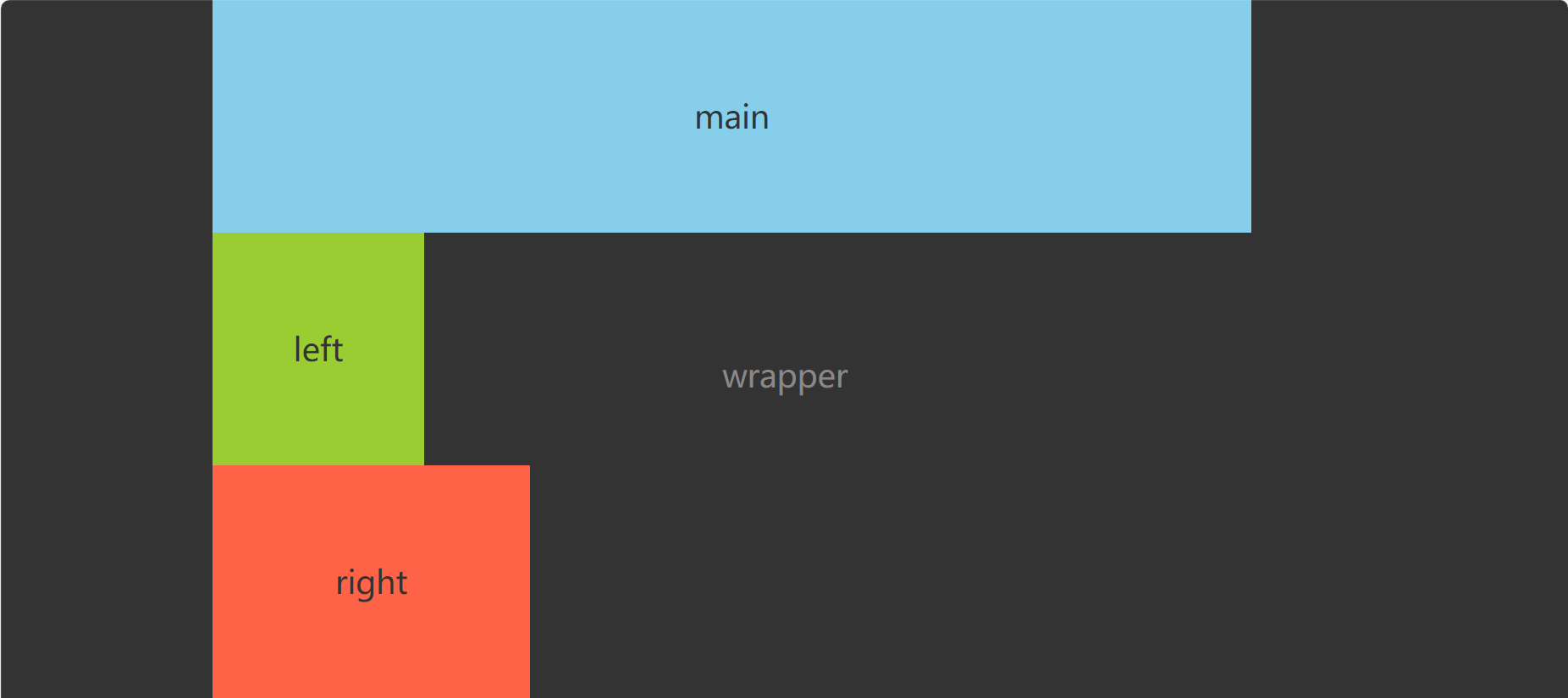
为了防止wrapper设置好padding会超出原大小,为wrapper设置
box-sizing: border-box;,然后设置其内部左右边距大小,此时左栏为200px,右栏为300px:1
2
3
4.wrapper {
box-sizing: border-box;
padding: 0 300px 0 200px;
} -
然后将三个部分使用左浮动:
1
2
3.col {
float: left;
} -
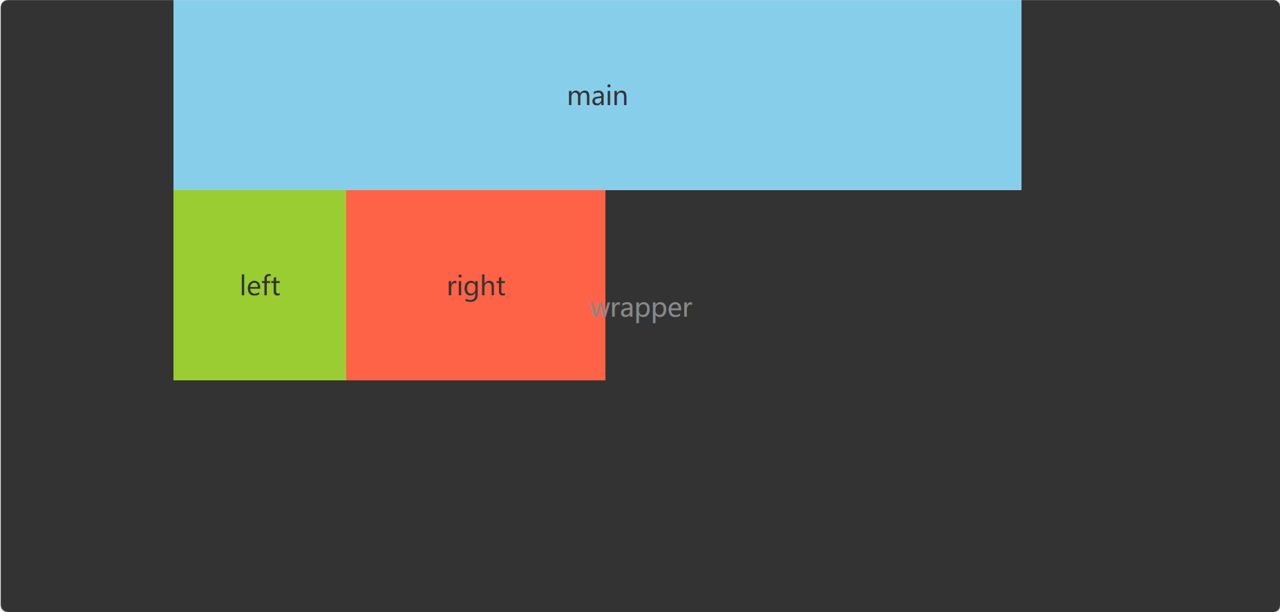
中间主体部分完整宽度由main占据,再分别为左右两栏设置宽度:
1
2
3
4
5
6
7
8
9
10
11.main {
width: 100%;
}
.left {
width: 200px;
}
.right {
width: 300px
} -
现在使用左右两栏的
margin-left将其移动到main的同一行1
2
3
4
5
6
7
8
9.left {
width: 200px;
margin-left: -100%;
}
.right {
width: 300px;
margin-left: -300px;
} -
再使用定位将左右两栏分别移动到对应位置:
1
2
3
4
5
6
7
8
9
10
11
12
13.left {
width: 200px;
margin-left: -100%;
position: relative;
left: -200px;
}
.right {
width: 300px;
margin-left: -300px;
position: relative;
right: -300px;
} -
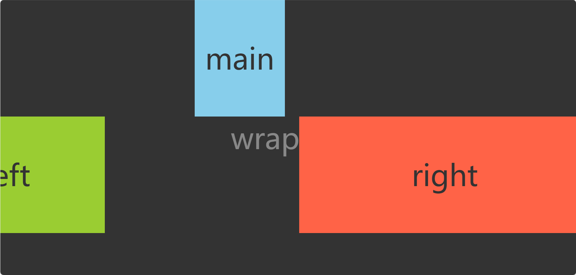
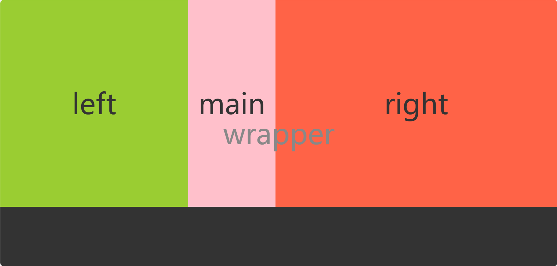
圣杯布局的缺点为在放大到一定尺寸(left部分宽度>main部分宽度)时会出现布局混乱

双飞翼布局
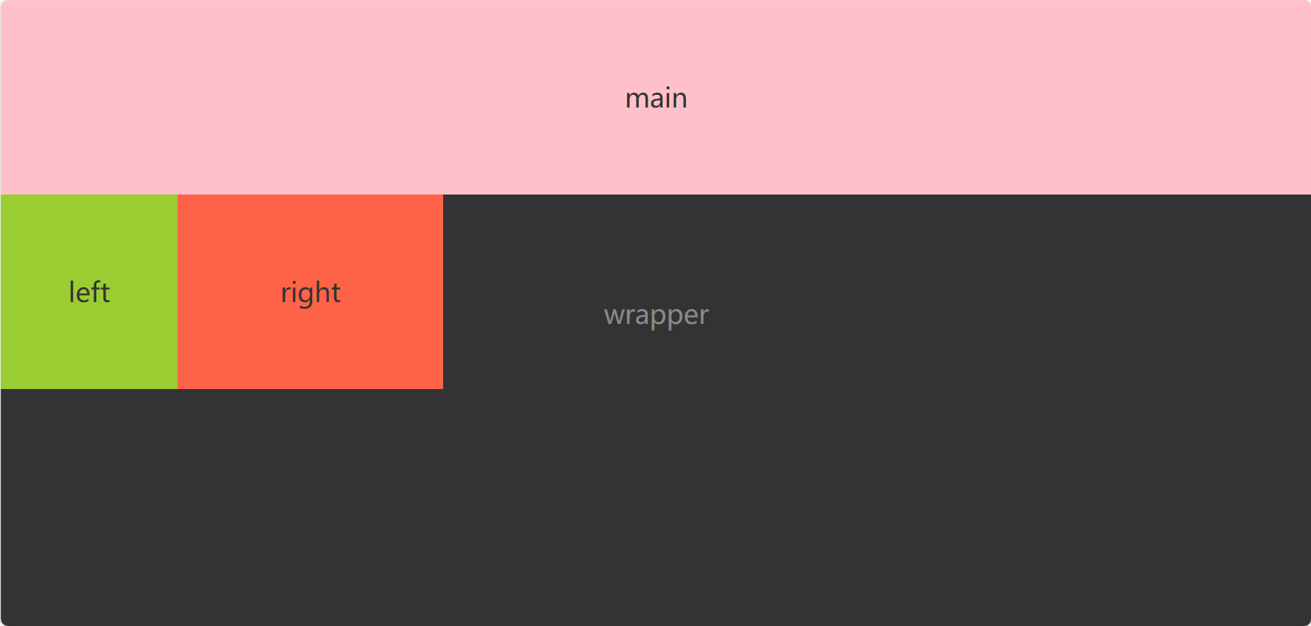
- 与圣杯布局类似,双飞翼布局则是使用main部分的margin为左右两栏预留空间。
- 优点:解决了圣杯布局放大后会混乱的问题。
- 缺点:需要增加一层DOM节点
原理
-
建立HTML结构如下:
1
2
3
4
5
6
7
8
9<body>
<section class="wrapper">
<section class="col main">
<div class="main-wrap">main</div>
</section>
<aside class="col left">left</aside>
<aside class="col right">right</aside>
</section>
</body> -
为三栏分别设置宽度并向左浮动:
1
2
3
4
5
6
7
8
9
10
11
12
13
14
15.col {
float: left;
}
.main {
width: 100%;
}
.left {
width: 200px;
}
.right {
width: 300px;
} -
在main部分设置外边距为左右两栏预留空间:
1
2
3.main-wrap{
margin: 0 300px 0 200px;
} -
再使用
margin-left将左右两栏移动到其对应位置:1
2
3
4
5
6
7
8
9.left {
width: 200px;
margin-left: -100%;
}
.right {
width: 300px;
margin-left: -300px;
} -
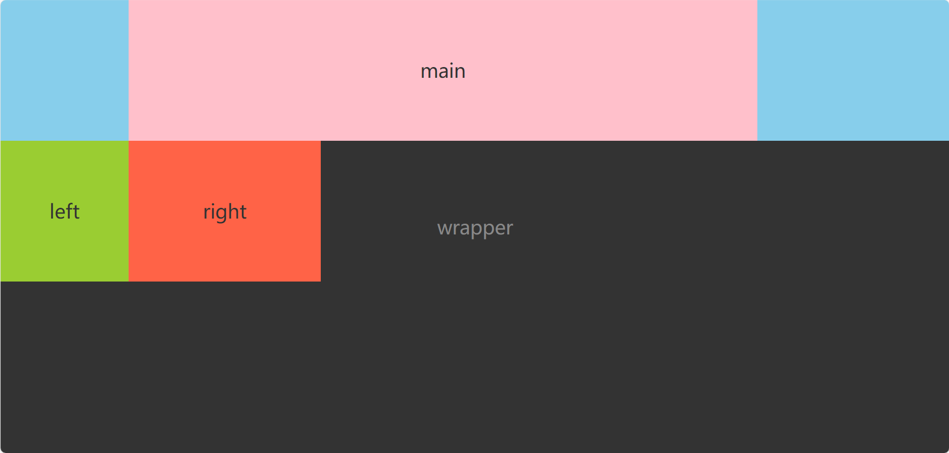
双飞翼布局在放大后则不会出现布局混乱

评论